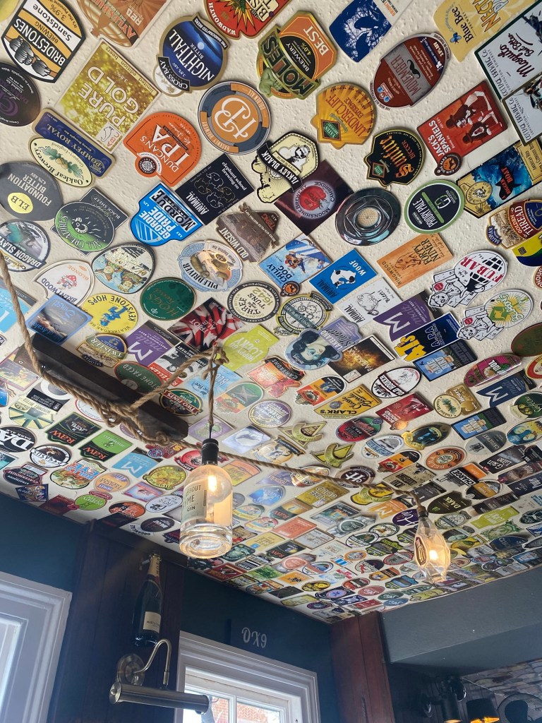
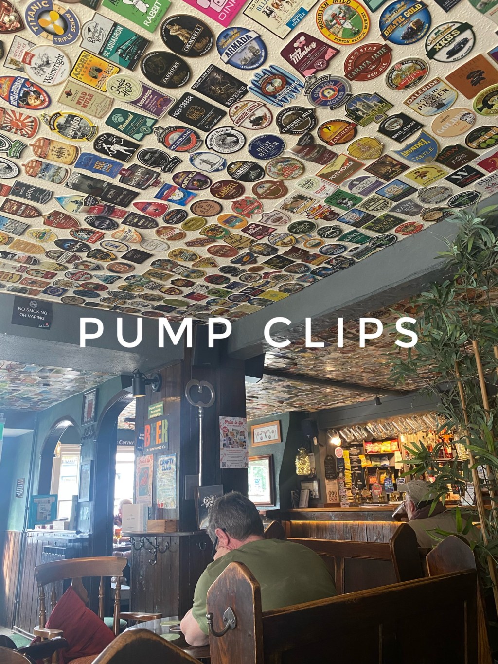
I’m sitting in a prime seat in the Cross Keys, a popular ale pub in the town centre of Thame, Oxfordshire. I’ve got a spot in the far corner, looking across the entire room. From my seat I can see the V-shaped bar, with its rows of taps and tankards hanging above them, I can see the front door that swings intermittently as customers come and go. I can see all of the dozen or so other drinkers dotted around room, and, to my left I can look out of the window, to the cars and pedestrians going by. Although I can see all of these things, I’m not actually looking at any of them at all. Instead, I am craning my head upwards to examine the ceiling, which is adorned entirely with pump clips.

The pump clip (or pump badge) display is a common feature in beer focussed free houses up and down the country. They generally take up dead space like ceilings, toilet or corridor walls, or on panelling above the bar (like the remarkably dense pump clip display at The Harp in Covent Garden). They are a great way to signal to newcomers that the pub knows its ale, create some visual stimuli for drinkers, and, on large displays like the one above my head, they act as a sort of unofficial ale museum.
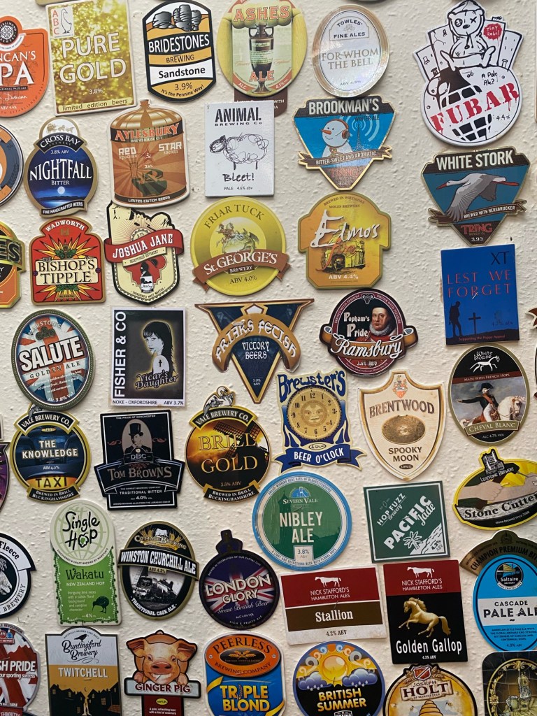
By my rough estimation there are more than 1500 clips on the ceiling of The Cross Keys that have been amassed over a couple of decades. The display chronicles changes in tastes of consumers, standards of branding and changes of fortunes of breweries within the time period. I can see early badges from breweries that started in a garage and have clawed their way to national recognition. I can see badges of breweries that no longer exist, others from breweries who have changed names & ownership, and other evergreen brands that have stood the test of time. It is a snapshot of an ever changing scene, from the turn of the century to the present day.
The microbrewery boom of the early 2000’s was a time of unrivalled enthusiasm and minimal expertise, and this is evident in the older clips. Most people who capitalised on the Small Brewers Relief enacted by the Labour government in 2002 by setting up their own enterprise, did so purely out of the love of beer. Brew kits were rustic, processes were unrefined and understanding of marketing needs was rudimentary at best. From a contemporary perspective many of these badges aren’t just dated, they are shoddy, with inconsistent fonts, poor design work and zero brand alignment between clips. But back then it didn’t really matter, because they were all like that. Brewers didn’t need the boldest, most Instagram-friendly badge, you just needed something that said the name on it and looked vaguely interesting. When viewed in isolation these old clips look terrible, but when combined, patchwork, into one big body they become an endearing snapshot of a more innocent (or do I mean naive?) time in the industry. A simpler time when good beer was deemed enough, and phrases like ‘brand assets’ and ‘tone of voice’ were reserved for the large regional and national breweries.

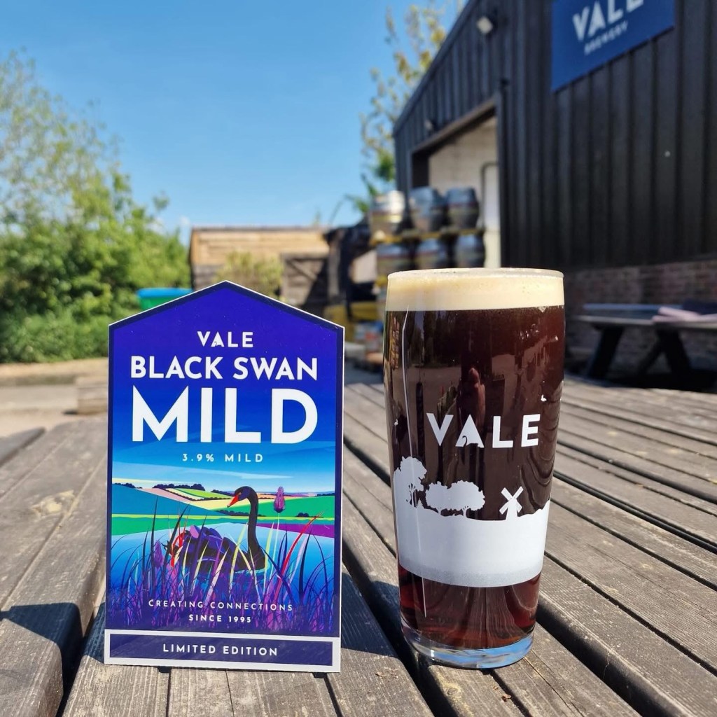
The pint I am drinking whilst I soak all this in is called Black Swan Mild, by Vale Brewery, brewed just a handful of miles from the pub. Vale is perhaps a great example of the change in brand and marketing importance in the microbrewery scene. The brewery was set up in 1995, achieved some local success for twenty odd years, off the back of some decent brews. They moved locations, expanded the kit, opened a couple of pubs and took on a sub- brand, ABC (Aylesbury Brewhouse Co). But by 2018 it seemed to be a company in retreat. The beers were being seen locally less and less, the pubs were sold off, and the branding, which was to industry standard ten years prior, now looked fatigued and dated. I remember asking a fellow drinker in a pub in 2023 if Vale still existed, such was the fall of their local reputation. The following year however, the brewery was bought by brothers Joe and Jimmy Brouder, and one of the first things they did was instigated a complete brand overhaul, bringing in branding consultant The Brand Weaver (if you are on beer social media currently you won’t be able to miss Tim and his work). Together they have relaunched Vale with contemporary, yet timeless branding that speaks of their place and purpose. The rebrand has been a huge success and picked up a Brewers Choice Award for branding of the year. From my spot in The Cross Keys I can see the new Black Swan Mild pump clip beaming from the bar, dusk-blue and classy. If I drag my eyes back half way across the room I can see the old badge for the same beer on the ceiling, forlorn and dreary. It wasn’t always so, for many years that badge was good enough, until one year it wasn’t. To an outsider Vale now looks in rude health, long may it continue.

I do wonder how the beer industry branding of today will age. What will we think of it in ten or twenty years time? How will expectations of small breweries change in the coming years. The industry has had to sharpen up, due to wider economic issues. The space for glorified hobbyists and charming amateurism is much diminished from a dozen years ago. Branding is better now than its ever been, on the whole. But the advent of cheap AI is becoming all pervasive and is already being used by struggling small breweries. I hope that in a similar experience in the future, I am not casting my eyes over hundreds of badges of generative slop. At least the poor design work of the early 21st century was done by real people. The microbrewery pump clips of the early 21st century are authentic and unique, even if they’re not generally very good.

Leave a comment